For most data scientists, a toolkit like scipy/matplotlib or R becomes so familiar that it becomes almost an extension of their own mind. When fleshing out an idea, we will just open up ipython, write a few lines of code, and display the plot on the screen to get a feel for the general idea. One very nice thing about such toolkits is that although the code may be short and simple, the plots are beautiful and precise.
The latter can be a problem when communicating with others (particularly non-technical others), however. A clean, crisp and precise plot can fool the reader into believing that a scematic diagram is an exact description of the world.
Of late, I've discovered a great way to reduce misunderstandings is with the xkcd function in matplotlib.
One example of the phenomenon of people misinterpreting back of the envelope calculations as precise computations is a blog post I wrote last year. I wrote a tutorial on monte carlo simulation in python. Because the topic du-jour at the time was Basic Income, I used that as an example topic. The main purpose of the post was to illustrate Monte Carlo simulation in Python. I was very clear (in words) that all I was doing was a back of the envelope calculation:
It's also important not to be blinded by a model. The involvement of numbers does not make an argument empirically correct - it simply makes it more understandable and less likely to be logically flawed.
Nevertheless, a large number of people seemed confused by what I was actually proposing, believing I was imputing far more precision than I actually was.
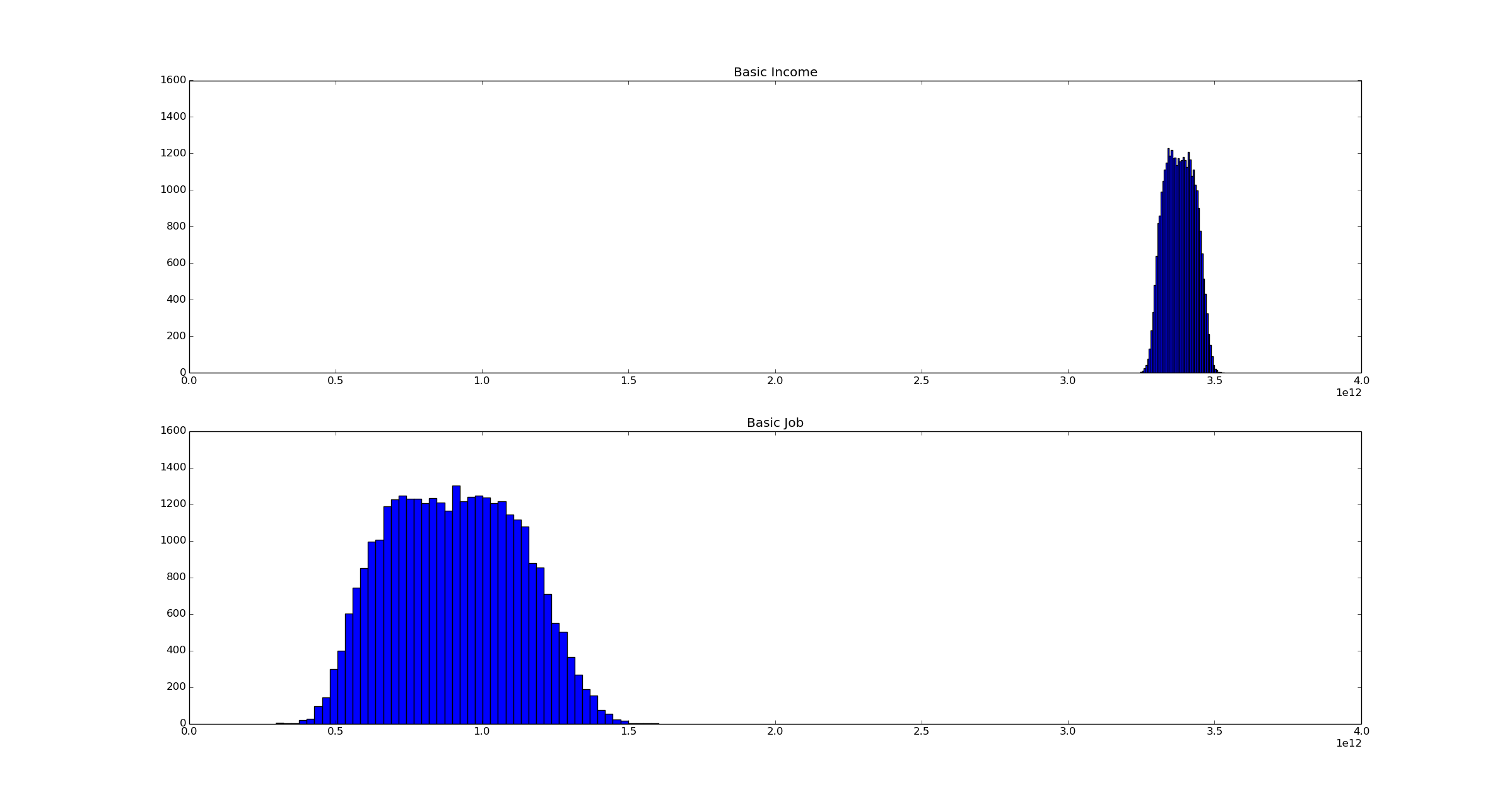
Here is the publication-quality graph I displayed in the article:
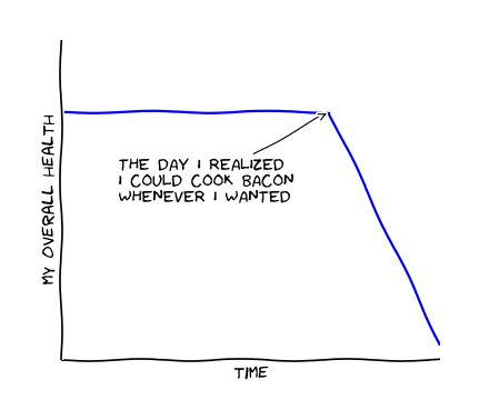
If I had known about xkcd() plotting when I wrote it, this is what I would have done:
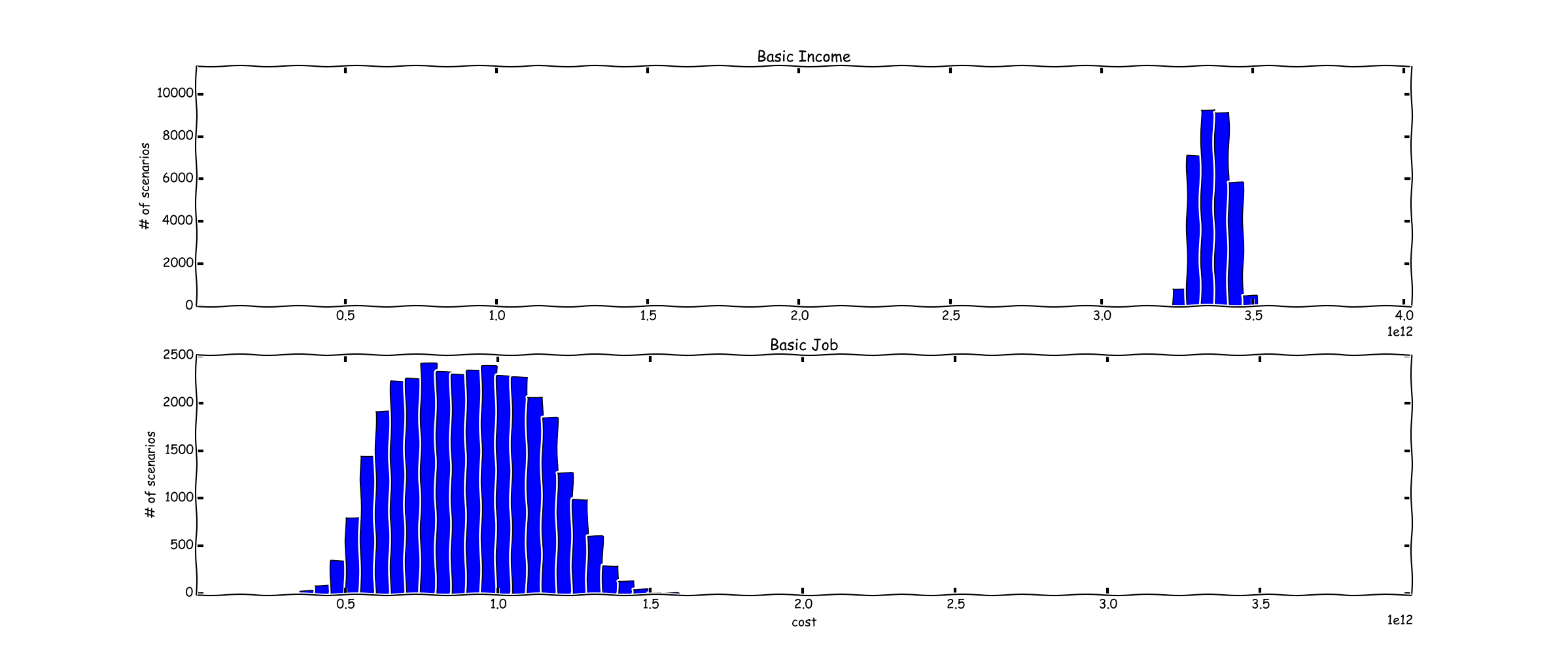
The rough, seemingly hand drawn nature of the graph provides a visual hint as to the imprecision of the results.
Here is another example, which I'm stealing from Eric Liu.
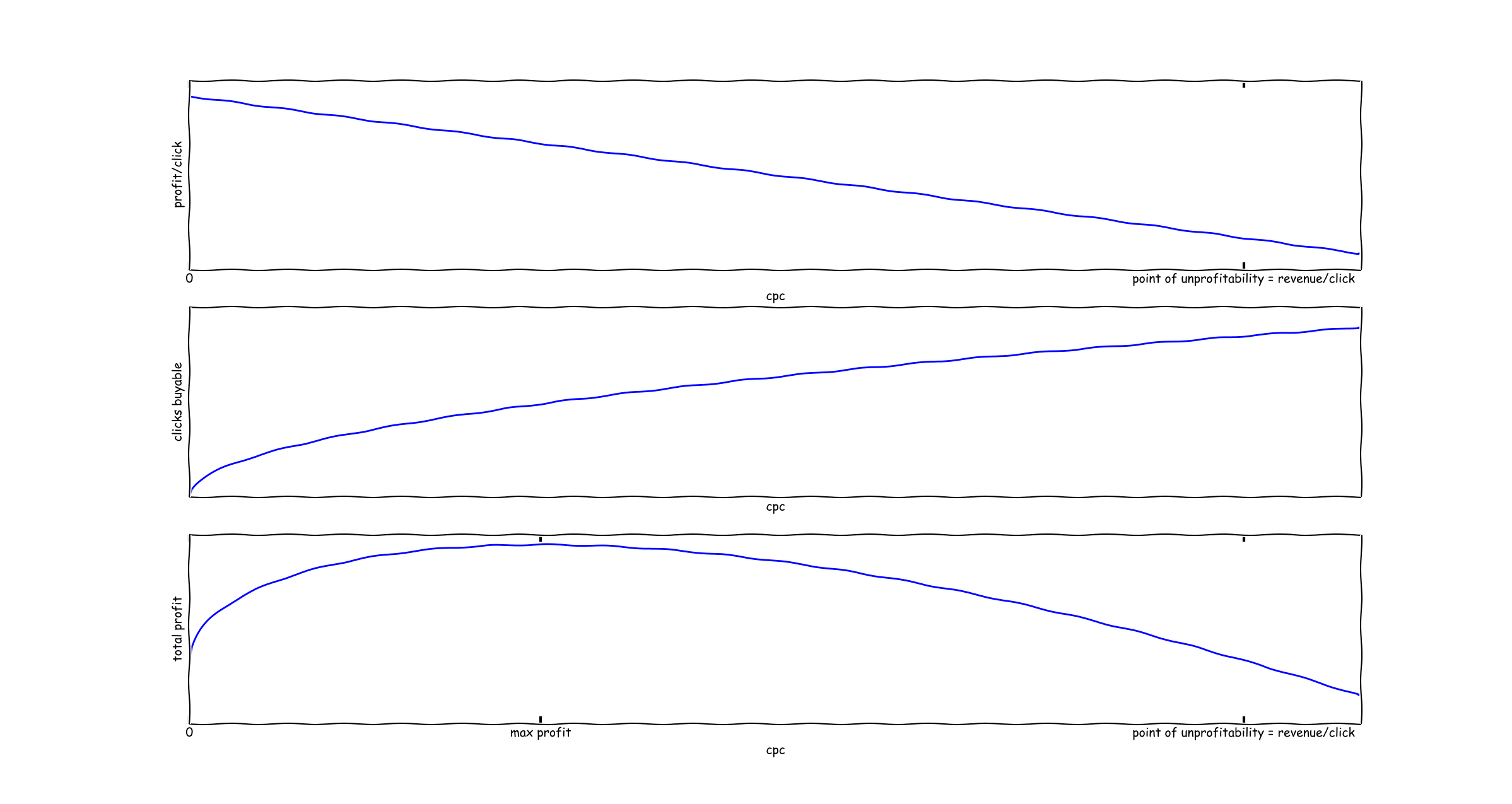
The first graph illustrates the profit/click of an adwords campaign - it's always profit - cpc. The second graph illustrates the number of clicks you can buy at a given cpc level. The last graph illustrates the primary point of his blog post - there is a profit maximizing cpc to choose in an adwords campaign. It lies somewhere between 0 and revenue/click.
And very importantly, these graphs are just an illustration. It would be wrong to interpret a precise location of the point of profit maximizing - e.g., profit maximizing is 1/3 of profit/click.
People don't read
No one reads disclaimers, caveats, or explanations of graphs. They look at pictures. So it's important to make sure that the pictures reflect your intent.
I've tried this a number of times since discovering xkcd (in private contexts which I can't share, unfortunately) - displaying schematic data in xkcd mode and precise data in normal matplotlib style. It's actually been quite useful at reducing the odds of people interpreting schematic diagrams as something more than they are. Try it out, it might work for you too.
P.S. Patrick McKenzie points out napkinlaf, a library doing a similar thing for Java UI. Paulgerhardt also pointed out Don't Make the Demo Look Done.